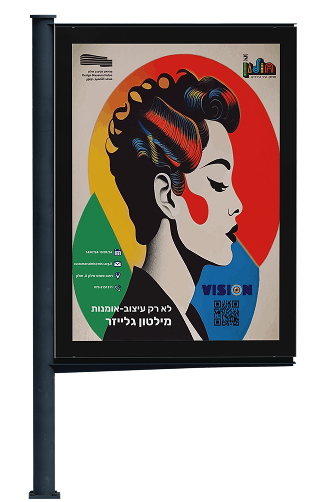
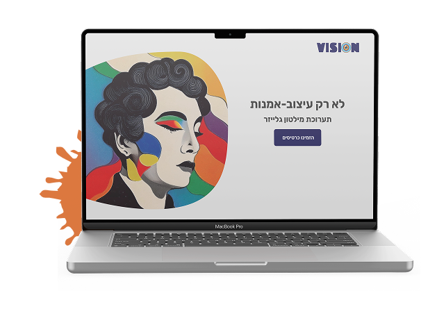
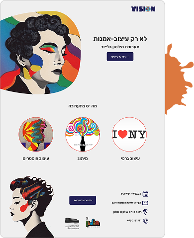
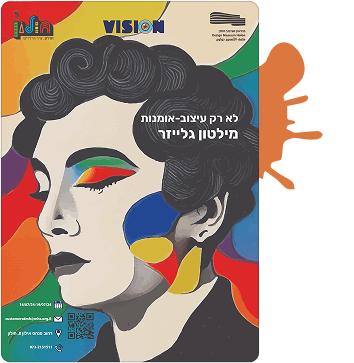
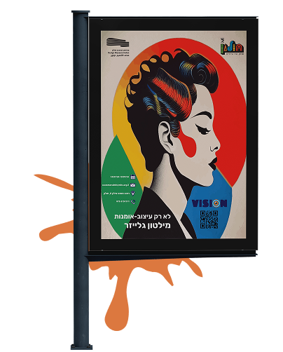
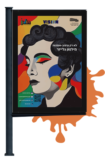
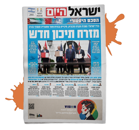
This project is a conceptual branding design for an exhibition dedicated to Milton Glaser, one of the most influential graphic designers of the 20th century. The goal was to celebrate Glaser’s legacy through a contemporary visual identity that reflects his emotional, bold, and idea-driven design style.
The Solution
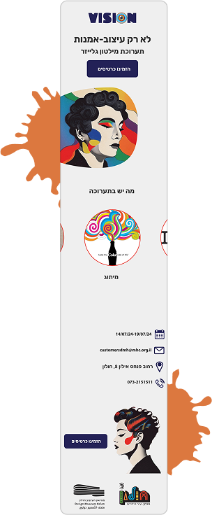
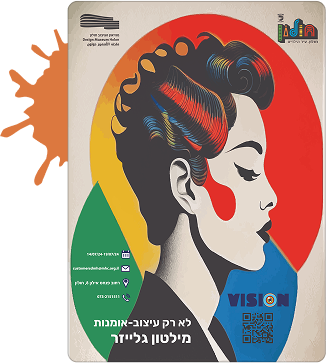
The exhibition logo features a simple and clean typographic approach, combined with symbolic elements that echo Glaser’s visual language. The color palette uses rich contrasts and warm hues that are reminiscent of 1970s graphic culture. Posters and promotional materials incorporate layered visual messages, much like Glaser’s own work, using form and typography to convey feeling and information together.
The Goal
The objective was to create a complete visual concept for a museum exhibition that introduces Glaser’s work to a wide audience. This includes professional designers, students, and international visitors, while remaining true to Glaser’s creative spirit.
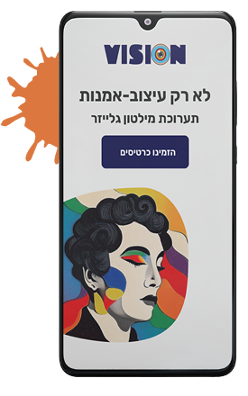
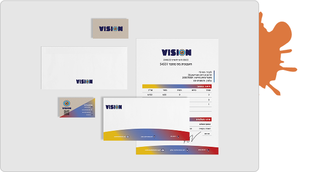
Logo
The logo blends a shimmering disco ball with bold, flowing typography inspired by 1970s club culture. It captures the energy, light, and movement of the dance floor while staying clean and versatile. Designed to work across posters, merchandise, and digital platforms, the logo serves as a vibrant and memorable symbol of the festival’s disco spirit.
The logo blends a shimmering disco ball with bold, flowing typography inspired by 1970s club culture. It captures the energy, light, and movement of the dance floor while staying clean and versatile. Designed to work across posters, merchandise, and digital platforms, the logo serves as a vibrant and memorable symbol of the festival’s disco spirit.